I never did get a chance to show off any of my personal work, so I guess now's a time to do it as I rest my brain a bit from all this mobile design talk.
Unfortunately I don't have SUPER recent stuff nor are they all in one place, but I'll show what I have.
First up, I have a web-based portfolio featuring illustrations, graphic design works, and a video. The site itself was created during my 2011 Spring semester at HPU through Natalie Lewis's Web Design class. We were able to upload our final versions of it our project onto her server. Unfortunately, it's been so long since I've touched it that I've forgotten the password in order to upload more recent things. The works featured are from 2008-2011. My resume as of Spring 2011 is also there.
Majority of the graphics were class assignments. Illustrations were more for fun and presents for friends. The video was a video project in which we had to create a music video. I chose "Mario Kart Love Song" by Sam Hart, who I'm friends with.
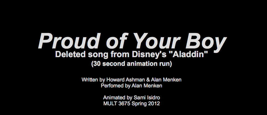
Next is a 30-second rather unfinished flash animation (CAUTION: IT'S ON AUTOPLAY) I did during Spring 2012 in Natalie Lewis's Web Design with Flash course. This was my first experience with Flash. The backgrounds were created with Photoshop. It's a fraction of a deleted song from the Disney film Aladdin called "Proud of Your Boy". In an earlier version of the movie, Aladdin had a mother character whom he longed to be a better person for instead of what he was now. That song was about his thoughts on it and basically him apologizing to her for being who he is.
And last is my index of projects for my HTML & Web Design class I took during Fall 2012 while I was still in Florida working at Walt Disney World. So, using my resources, I made my final project as a web-based map of the Magic Kingdom. Every photo featured in the Mouse Maps project was taken by me/was taken with my personal camera. The layout is very similar to my portfolio I made in 2011.
Monday, May 6, 2013
Have another Heuristic
Looks like we're reviewing prototypes once again via Heuristic Evaluation and Severity Ratings just like Week 7 and Week 5.
Since I'm still a Designer, I'll be reviewing another Programmer's Balsamiq and this week I've chosen Jeff's. (7:58)
Aesthetic and minimalist design (I meant that instead of Flexibility and efficiency of use in the video)
Since I'm still a Designer, I'll be reviewing another Programmer's Balsamiq and this week I've chosen Jeff's. (7:58)
Aesthetic and minimalist design (I meant that instead of Flexibility and efficiency of use in the video)
- Streamlining by eliminating extra functions that seem redundant such as keeping Requests under Friends, Trades under Marketplace, and Chat under Inbox. (Severity Rating: 1.5)
- Match between system and the real world
- I like that it's similar to what a previous version of Facebook looks like, so it's familiar and makes navigation easier. (Severity Rating: 0)
- Consistency and standards
- Not really sure what the search bar is for in the profile unless it's ultimately for searching for specific shoes within the profile or the same search for the Marketplace? (Severity Rating: 2)
- User Control and Freedom
- Inbox needs a New Message, assuming right now the only way to start a new message is exiting out of the Inbox then going into the Friends list/Marketplace to get contact information then send a message. (Severity Rating: 3)
Particular Patterns
The first part of this week's assignment was to blog about patterns found in 4ourth.com's article on Composition for Mobile designs.
On the left is a screenshot of an ad that popped up after the initial "PANDORA" screen during the start up of the app. The screenshot on the right is an ad that popped up during use-time of the app. In order for the company to provide free music for their listeners, it heavily relies on advertising to fund their services (along with the Pandora One service that eliminates ads by asking users to pay every so often to use their product).
Not every app has an obnoxiously large ad space. Some rely on smaller banners or sponsored posts that end up in feeds. A few feature special add-ons that are based on/designed by the sponsor(s). Pandora also relies on audio and/or video ads they sprinkle throughout the use-time of their app (and website service).
These are screenshots of the loading screen, the simpler name for "Intertsitial Screen", that pops up for the app LINE PLAY. The app itself is pretty memory heavy, so it usually needs the loading screen when starting up. This prevents the user from clicking anywhere else on the screen to stop the loading process... Well, save for the Home, Back, Options, and Search keys on an Android phone like my Droid 4. LINE PLAY also uses it as an opportunity to share tips on how to play the game, as shown in the screenshot on the right, and further social interactions between players in the game.
Advertising
On the left is a screenshot of an ad that popped up after the initial "PANDORA" screen during the start up of the app. The screenshot on the right is an ad that popped up during use-time of the app. In order for the company to provide free music for their listeners, it heavily relies on advertising to fund their services (along with the Pandora One service that eliminates ads by asking users to pay every so often to use their product).
Not every app has an obnoxiously large ad space. Some rely on smaller banners or sponsored posts that end up in feeds. A few feature special add-ons that are based on/designed by the sponsor(s). Pandora also relies on audio and/or video ads they sprinkle throughout the use-time of their app (and website service).
Interstitial Screen
These are screenshots of the loading screen, the simpler name for "Intertsitial Screen", that pops up for the app LINE PLAY. The app itself is pretty memory heavy, so it usually needs the loading screen when starting up. This prevents the user from clicking anywhere else on the screen to stop the loading process... Well, save for the Home, Back, Options, and Search keys on an Android phone like my Droid 4. LINE PLAY also uses it as an opportunity to share tips on how to play the game, as shown in the screenshot on the right, and further social interactions between players in the game.
Sunday, May 5, 2013
Allison's App
We're also encouraged to choose someone, if we're a designer, who is a programmer to evaluate this week. So, I picked Allison.
(... Screencast-O-Matic took a bit for me to use since OSX 10.8 doesn't support Java. Apparently OSX 10.6 aka Snow Leopard, which I previously had, only needed to activate the plug-in from the browser versus me downloading it from the site entirely. Even after downloading the plug-in, it still didn't work so I went hunting for an add-on that did. Chalk up another reason for me to dislike Mountain Lion with all my being.)
Anyway, here's the video. Sorry for some redundancies. (9:19)
It wasn't till after I recorded that I realized the score screen was an accumulative score screen as if several rounds were already played.
Visibility of system status
It wasn't till after I recorded that I realized the score screen was an accumulative score screen as if several rounds were already played. Perhaps have a Round #XX at the Score screen to indicate how far along they're in the game. (Severity Rating: 2)
Error prevention & Help users recognize, diagnose, and recover from errors:
Clicking the 'X' goes back to home and seems to restart the game, but what if a user clicks it on accident? Ten rounds in, there's no way to prevent that. (Severity Rating: 3)
User control and freedom:
Kind of like the above concern except going back to a screen say changing names when already on Bid screen or changing bid when on Tricks. Just in case they realized an error after clicking to the next screen/accidentally clicked somewhere other than they intended. (Severity rating: 3)
Consistency and standards
Not really sure what "tricks" is. Is this scoring system only for one type of game? Because if one is keeping score for Scrabble, one only needs to add points once every round. (Severity Rating: 4)
Already Apps
Continuing with week 7, our next blog is supposed to be about two apps that are similar to what we've been planning and do a Heuristic Evaluation along with Severity Ratings on them, similar to what we did in week 5. Images shown are screencaps from my Motorola Droid 4.
A fairly simple app with basically three screens in the first version: Events, Births and Deaths, with the option to Save Offline. Two extra options were added to the newer version where the user can change the date and, from what I'm assuming, can refresh the data by choosing the Globe icon. There's no indication of what it does exactly besides bring up a "Loading..." window.
Very similar to v1.72 of the previous app, except with widget extension. There is no option to change the date or to sort by Events, Births, and Deaths. Then again, it sticks to the name "TODAY in history", not whenever in history.
Today in History by Mad Labs
v1.72 (left) & Version 1.04 (right) found in the Google Play Store.A fairly simple app with basically three screens in the first version: Events, Births and Deaths, with the option to Save Offline. Two extra options were added to the newer version where the user can change the date and, from what I'm assuming, can refresh the data by choosing the Globe icon. There's no indication of what it does exactly besides bring up a "Loading..." window.
Aesthetic and minimalist design: Very clean and straight forward. I kind of like how the icons for the Events, Births, and Deaths disappeared in the second version, which frees up more screen space when the Options menu is chosen.
Visibility of system status & Recognition rather than recall: The user can infer that the calender icon changes the date and is then notified that that is the function that changes it. Although the Globe icon next to it doesn't have anything describing its function.
- Frequency: Problem doesn't exist.
- Impact: N/A
- Persistence: N/A
- Severity Rating: 0
- Frequency: Rare, I guess if the user presses it.
- Impact: The loading disappears pretty quickly, so it doesn't make too much of an impact.
- Persistence: Once the user figures it whether or not the data is refreshed then it doesn't become a problem.
- Severity Rating: 2, it leaves the user questioning what it does if nothing happens exactly if there's no data to load.
Today in history by Banjen Software
v1.6 found in the Google Play Store. From left to right, Main screen with options shown, Widget Settings screen, 4x1 widget (above Dictionary.com widget).Very similar to v1.72 of the previous app, except with widget extension. There is no option to change the date or to sort by Events, Births, and Deaths. Then again, it sticks to the name "TODAY in history", not whenever in history.
Aesthetic and minimalist design: The app itself is clean and easy to understand and allows customization for the widget. Although it would be nice to have the option to change the opacity of the widget background when the wallpaper of the phone is possibly busy (like mine kind of is in the location it's at).
- Frequency: As often as the user uses the widget.
- Impact: It's only an impact if the user uses the widget and has a busy phone wallpaper.
- Persistence: Same as above.
- Severity Rating: 1, the user has the option to use the widget or not, so they can rely on the app instead which is easier to read.
Saturday, May 4, 2013
Nifty Navigations
Another part of the assignments for this week was to choose three designs from Mobile Design Pattern Gallery and blog about why we like them. So, let's get started!
First off is Flikr's dashboard design. The search bar doesn't take up too mach space, so it doesn't take the attention away from the main content, the pictures, but it's still in a convenient place for users to access whenever they want. The same goes for the navigation away from the dashboard found out the bottom of the screen. I've never used this app since I don't have flickr, but I wonder if there's an option to change the size of the pictures on how they appear on the dashboard.
Next is the Duke University App's Springboard. At least, I'm assuming that's what this is. I think it's clever to mimic the way the iOS for the iPhone looks for an app FOR the iPhone so it's a way of navigating that the user is familiar with. That's basically what caught my eye for this navigation design choice.
And then third is Net-A-Porter's Springboard. I rather like this because it reminds me of how clothing websites look, such as Gilt and MYHABIT (need a membership to see it).
There's a little preview of what products are available before accessing the gallery of things behinds each of those buttons. It's clean and already sorted by category for users' ease of navigation.
Basic Blogging
In the subject of blogging, I suppose I've been doing so since 2004 in a more-journalistic style through an art/design gallery/community I was a part of back in middle school to high school. Then in high school I got into video blogging, vlogging, via YouTube and blogTV which led me to using the micro blogger Twitter. Unfortumately, I barely use those platforms as often as I used to now. Being restricted to 140 characters for Twitter, I wanted something more, so I moved to Tumblr around 2009 and haven't really drifted away from it since. I find it easy to navigate, but the recent update on the Dashboard's interface is rather frustrating since it's extremely different from what it has been for the past 4 years.
This week, one of our assignments was to pick a blog and write about an article from one of those blogs based on another article on effective blog posts. Randomly from the list, I chose lovelyui.com, which happens to be a Tumblr blog.
Since I'm a frequent user of Tumblr, I know that it's heavily image based, and most of the time those images don't have a description to go with it unless it's sharing interesting facts about the picture, reactions to the image, or witty comebacks to previous comments. Lovely UI is no exception to this rule. I can't really choose an article since there aren't any with words that describe anything in depth on the blog besides the tags that help categorize the photos and help users find those pictures and less-than-a-sentence saying what it is and where it's from. The site itself is more like a gallery of mobile design interfaces that people can use for references. If you click on a post, it's basically the same thing that you see on the main blog, minus the other pictures.
So, I'd classify this "blog" more of an online gallery than an actual blog.
This week, one of our assignments was to pick a blog and write about an article from one of those blogs based on another article on effective blog posts. Randomly from the list, I chose lovelyui.com, which happens to be a Tumblr blog.
![]() |
Lovely UI's front page as of May 4, 2013 |
![]() | |
http://www.lovelyui.com/post/47379687492/ |
So, I'd classify this "blog" more of an online gallery than an actual blog.
Subscribe to:
Posts (Atom)