Sunday, May 12, 2013

Different Designs

So, I will be working with Jeff for the final project. We'll be using his MyKicks app, which is kind of like an eBay-esque thing that allows users to buy and sell shoes. I did a Heuristic evaluation on the Balsamiq and the Jeff created the original Balsamiq.

The original Balsamiq had a Springboard-like menu to serve as the app's dashboard with nine icons.

  • Profile
  • Friends
  • Marketplace
  • Inbox
  • Chat
  • Requests
  • News
  • Trades
  • Photos

He figured he wanted to simplify it even more to four icons, or even just four sections of the dashboard

  • Profile
  • Marketplace
  • Inbox
  • News
The dashboard as a SpringBoard could be easily kept, but, like suggested with my app instead of having screen that stops the user from getting immediate information, having one of the functions, probably the Marketplace or News open initially after sign in would be a more convenient choice. This eliminates a step in choosing the news feed.

Initiate Implementation

It's a bit late in the semester for me to be working on this... I originally had this blog entry first typed up on the 6th, but finals week took over and I never got to finish it.

IF I had the time to implement my app, going along with my When in the World app, I'd probably use Wikipedia to get facts. Although I was thinking about narrowing it down to Disney facts -- since I'm such a big Disney buff and former employee of the company. It would narrow down information by A LOT. But then I think I would run into copyright infringement problems or something, not that any of it is intentional. Another concern could be how/where to gather facts and would there be enough for every single day of the year. Would it only be movies? Or include the parks? etc. etc.

Then I would first figure out the basic layout of the app the first week. It's probably going to have 4 (or 5? 4.5?) basic screens

  • General fact screen
  • Change Date screen
  • Only movie/studio fact screen
  • Only park fact screen
  • Share screen (or pop up)
Week two would consist of creating graphics for those screens. 

Week three and four would be gathering information. (as much as I could)

Five would be testing while week six would be correcting and tweaking final touches.

Again I actually don't have this time, so everything here is hypothetical.

Classifying Components

4ourth Mobile created an article based patterns used to Display Information and out assignment this week was to blog about two of those patterns.

Vertical List


This is a screenshot from the Android version of the Starbucks app as shown on my Droid 4. It features a vertical list, specifically a thumbnail list since it has thumbnails of each card that's a part of the user's account with accompanying data that shoes the amount in the card, name of the card and last 4-digits (blurred), as well as the date it was last used. The icon to the right of the data allows the user to change the order of cards by holding and dragging their selection up or down.

Grid


This screenshot features the Friends list for the LINE PLAY app and it uses a grid pattern to display players' avatars along with usernames labeling each one. It scrolls vertically and is arranged alphabetically by username. Small icons show if they're new friends (small red circle with 'N') and whether or not they're official avatars (owned/promoted by company; not shown). Clicking on an avatar brings up a Popup menu that features the full avatar and choices for the user to interact with their friends.

I wanted to add these screenshots to the 4ourth mobile wiki, but unfortunately I can't figure out the TextCha answer, or the network would time out.

Monday, May 6, 2013

Pardon my Portfolio...

I never did get a chance to show off any of my personal work, so I guess now's a time to do it as I rest my brain a bit from all this mobile design talk.

Unfortunately I don't have SUPER recent stuff nor are they all in one place, but I'll show what I have.


First up, I have a web-based portfolio featuring illustrations, graphic design works, and a video. The site itself was created during my 2011 Spring semester at HPU through Natalie Lewis's Web Design class. We were able to upload our final versions of it our project onto her server. Unfortunately, it's been so long since I've touched it that I've forgotten the password in order to upload more recent things. The works featured are from 2008-2011. My resume as of Spring 2011 is also there.
Majority of the graphics were class assignments. Illustrations were more for fun and presents for friends. The video was a video project in which we had to create a music video. I chose "Mario Kart Love Song" by Sam Hart, who I'm friends with.


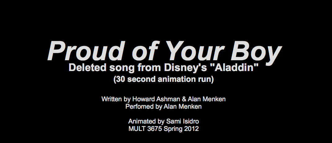
Next is a 30-second rather unfinished flash animation (CAUTION: IT'S ON AUTOPLAY) I did during Spring 2012 in Natalie Lewis's Web Design with Flash course. This was my first experience with Flash. The backgrounds were created with Photoshop. It's a fraction of a deleted song from the Disney film Aladdin called "Proud of Your Boy". In an earlier version of the movie, Aladdin had a mother character whom he longed to be a better person for instead of what he was now. That song was about his thoughts on it and basically him apologizing to her for being who he is.


And last is my index of projects for my HTML & Web Design class I took during Fall 2012 while I was still in Florida working at Walt Disney World. So, using my resources, I made my final project as a web-based map of the Magic Kingdom. Every photo featured in the Mouse Maps project was taken by me/was taken with my personal camera. The layout is very similar to my portfolio I made in 2011.

Have another Heuristic

Looks like we're reviewing prototypes once again via Heuristic Evaluation and Severity Ratings just like Week 7 and Week 5.

Since I'm still a Designer, I'll be reviewing another Programmer's Balsamiq and this week I've chosen Jeff's. (7:58)


Aesthetic and minimalist design (I meant that instead of  Flexibility and efficiency of use in the video)
  • Streamlining by eliminating extra functions that seem redundant such as keeping Requests under Friends, Trades under Marketplace, and Chat under Inbox. (Severity Rating: 1.5)
Match between system and the real world
  •  I like that it's similar to what a previous version of Facebook looks like, so it's familiar and makes navigation easier. (Severity Rating: 0)
Consistency and standards
  • Not really sure what the search bar is for in the profile unless it's ultimately for searching for specific shoes within the profile or the same search for the Marketplace? (Severity Rating: 2
User Control and Freedom
  • Inbox needs a New Message, assuming right now the only way to start a new message is exiting out of the Inbox then going into the Friends list/Marketplace to get contact information then send a message. (Severity Rating: 3)

Particular Patterns

The first part of this week's assignment was to blog about patterns found in 4ourth.com's article on Composition for Mobile designs.

Advertising


On the left is a screenshot of an ad that popped up after the initial "PANDORA" screen during the start up of the app. The screenshot on the right is an ad that popped up during use-time of the app.  In order for the company to provide free music for their listeners, it heavily relies on advertising to fund their services (along with the Pandora One service that eliminates ads by asking users to pay every so often to use their product).

Not every app has an obnoxiously large ad space. Some rely on smaller banners or sponsored posts that end up in feeds. A few feature special add-ons that are based on/designed by the sponsor(s). Pandora also relies on audio and/or video ads they sprinkle throughout the use-time of their app (and website service).

Interstitial Screen


These are screenshots of the loading screen, the simpler name for "Intertsitial Screen", that pops up for the app LINE PLAY. The app itself is pretty memory heavy, so it usually needs the loading screen when starting up. This prevents the user from clicking anywhere else on the screen to stop the loading process... Well, save for the Home, Back, Options, and Search keys on an Android phone like my Droid 4. LINE PLAY also uses it as an opportunity to share tips on how to play the game, as shown in the screenshot on the right, and further social interactions between players in the game.

Sunday, May 5, 2013

Allison's App

 And last part of Week 7, we're supposed to do a Heuristic Evaluation and Severity Rating on a Balsamiq prototype that belongs to someone we haven't evaluated yet. In my case, I can't evaluate Martin's since I evaluated his paper prototype back in Week 5.

We're also encouraged to choose someone, if we're a designer, who is a programmer to evaluate this week. So, I picked Allison.

(... Screencast-O-Matic took a bit for me to use since OSX 10.8 doesn't support Java. Apparently OSX 10.6 aka Snow Leopard, which I previously had, only needed to activate the plug-in from the browser versus me downloading it from the site entirely. Even after downloading the plug-in, it still didn't work so I went hunting for an add-on that did. Chalk up another reason for me to dislike Mountain Lion with all my being.)

Anyway, here's the video. Sorry for some redundancies. (9:19)


It wasn't till after I recorded that I realized the score screen was an accumulative score screen as if several rounds were already played.

Visibility of system status 
It wasn't till after I recorded that I realized the score screen was an accumulative score screen as if several rounds were already played. Perhaps have a Round #XX at the Score screen to indicate how far along they're in the game. (Severity Rating: 2)

Error prevention & Help users recognize, diagnose, and recover from errors:
Clicking the 'X' goes back to home and seems to restart the game, but what if a user clicks it on accident? Ten rounds in, there's no way to prevent that. (Severity Rating: 3)

User control and freedom:
Kind of like the above concern except going back to a screen say changing names when already on Bid screen or changing bid when on Tricks. Just in case they realized an error after clicking to the next screen/accidentally clicked somewhere other than they intended. (Severity rating: 3)

Consistency and standards
Not really sure what "tricks" is. Is this scoring system only for one type of game? Because if one is keeping score for Scrabble, one only needs to add points once every round. (Severity Rating: 4)

Already Apps

Continuing with week 7, our next blog is supposed to be about two apps that are similar to what we've been planning and do a Heuristic Evaluation along with Severity Ratings on them, similar to what we did in week 5. Images shown are screencaps from my Motorola Droid 4.

Today in History by Mad Labs

v1.72 (left) & Version 1.04 (right) found in the Google Play Store.
A fairly simple app with basically three screens in the first version: Events, Births and Deaths, with the option to Save Offline. Two extra options were added to the newer version where the user can change the date and, from what I'm assuming, can refresh the data by choosing the Globe icon. There's no indication of what it does exactly besides bring up a "Loading..." window.
Aesthetic and minimalist design: Very clean and straight forward. I kind of like how the icons for the Events, Births, and Deaths disappeared in the second version, which frees up more screen space when the Options menu is chosen.
  • Frequency: Problem doesn't exist.
  • Impact: N/A
  • Persistence: N/A
  • Severity Rating: 0
Visibility of system status & Recognition rather than recall: The user can infer that the calender icon changes the date and is then notified that that is the function that changes it. Although the Globe icon next to it doesn't have anything describing its function.
  • Frequency: Rare, I guess if the user presses it.
  • Impact: The loading disappears pretty quickly, so it doesn't make too much of an impact.
  • Persistence: Once the user figures it whether or not the data is refreshed then it doesn't become a problem.
  • Severity Rating: 2, it leaves the user questioning what it does if nothing happens exactly if there's no data to load.


Today in history by Banjen Software

v1.6 found in the Google Play Store. From left to right, Main screen with options shown, Widget Settings screen, 4x1 widget (above Dictionary.com widget).
Very similar to v1.72 of the previous app, except with widget extension. There is no option to change the date or to sort by Events, Births, and Deaths. Then again, it sticks to the name "TODAY in history", not whenever in history.

Aesthetic and minimalist design: The app itself is clean and easy to understand and allows customization for the widget. Although it would be nice to have the option to change the opacity of the widget background when the wallpaper of the phone is possibly busy (like mine kind of is in the location it's at).
  • Frequency: As often as the user uses the widget.
  • Impact: It's only an impact if the user uses the widget and has a busy phone wallpaper.
  • Persistence: Same as above.
  • Severity Rating: 1, the user has the option to use the widget or not, so they can rely on the app instead which is easier to read.

Saturday, May 4, 2013

Nifty Navigations

Another part of the assignments for this week was to choose three designs from Mobile Design Pattern Gallery and blog about why we like them. So, let's get started!


First off is Flikr's dashboard design. The search bar doesn't take up too mach space, so it doesn't take the attention away from the main content, the pictures, but it's still in a convenient place for users to access whenever they want. The same goes for the navigation away from the dashboard found out the bottom of the screen. I've never used this app since I don't have flickr, but I wonder if there's an option to change the size of the pictures on how they appear on the dashboard.


Next is the Duke University App's Springboard. At least, I'm assuming that's what this is. I think it's clever to mimic the way the iOS for the iPhone looks for an app FOR the iPhone so it's a way of navigating that the user is familiar with. That's basically what caught my eye for this navigation design choice.


And then third is Net-A-Porter's Springboard. I rather like this because it reminds me of how clothing websites look, such as Gilt and MYHABIT (need a membership to see it).
There's a little preview of what products are available before accessing the gallery of things behinds each of those buttons. It's clean and already sorted by category for users' ease of navigation.

Basic Blogging

In the subject of blogging, I suppose I've been doing so since 2004 in a more-journalistic style through an art/design gallery/community I was a part of back in middle school to high school. Then in high school I got into video blogging, vlogging, via YouTube and blogTV which led me to using the micro blogger Twitter. Unfortumately, I barely use those platforms as often as I used to now. Being restricted to 140 characters for Twitter, I wanted something more, so I moved to Tumblr around 2009 and haven't really drifted away from it since. I find it easy to navigate, but the recent update on the Dashboard's interface is rather frustrating since it's extremely different from what it has been for the past 4 years.

This week, one of our assignments was to pick a blog and write about an article from one of those blogs based on another article on effective blog posts. Randomly from the list, I chose lovelyui.com, which happens to be a Tumblr blog.

Lovely UI's front page as of May 4, 2013
 
Since I'm a frequent user of Tumblr, I know that it's heavily image based, and most of the time those images don't have a description to go with it unless it's sharing interesting facts about the picture, reactions to the image, or witty comebacks to previous comments. Lovely UI is no exception to this rule. I can't really choose an article since there aren't any with words that describe anything in depth on the blog besides the tags that help categorize the photos and help users find those pictures and less-than-a-sentence saying what it is and where it's from. The site itself is more like a gallery of mobile design interfaces that people can use for references. If you click on a post, it's basically the same thing that you see on the main blog, minus the other pictures.

 
http://www.lovelyui.com/post/47379687492/

So, I'd classify this "blog" more of an online gallery than an actual blog.

Monday, March 4, 2013

Balsamiq Building

Little note before I start with the actual assignment, the internet at home as been pretty unpredictable for the past week and a half and will drop at random times, which would require me to restart the router/modem for it to work... Both are in my parents' room which I don't have access to after 9 PM. So doing homework at night proved to be difficult. The electronic deities haven't been very nice to me recently...

ANYWAY... On to this Week 6's assignment!

STEP 1: Revisiting the Heuristic Evaluation Results

Martin didn't really list specifically labeled HE critiques in his evaluation blog about my app, but I understood what could be changed. I think seeing what Balsamiq had to offer helped me redesign a few things.
  • Instead of reloading the screen with a warning for a wrong date error, I used a pop up alert
  • I moved the Previous and Next Fact buttons closer to the fact, away from the main navigation buttons
  • I was going to put a X out of X facts for each date between the Previous and Next buttons, but left it out in the balsamiq since I'm not going to add so many slides to change the number.
    (Although, in hindsight, I could have just put "#/#" as a place holder. Well, a bit too lazy to go back and edit, export, and upload again...)
    Nevermind, I redid it.
  • I decided against putting a picture since it's supposed to be a simple blurb about the fact. Details/pictures can be found at the source if people really are that curious about it.

STEP 2: Start Designing

I rather enjoyed using Balsamiq. It was pretty easy to use (and my copy & paste worked for the text, but not the elements themselves). I had a bit of trouble finding where to export as a PDF, but eventually I found it.
The actual Share button on the Sharing option slide doesn't work as it's supposed to lead to the appropriate app.
(Don't scroll through the slides; they're very out of order since they were made once they popped into my head/in order to keep consistency).


Monday, February 25, 2013

Expert Evaluating

Sooo, I decided to meet up with Martin on the 22nd since he had time after his internship. We met up at HPU's Downtown Campus's Computer Lab in the Mac room since they have gigantic iMacs and there wouldn't me a lot of people at the time we met up.

Here's a lovely video of our antics as I evaluated the prototype for his "Joke Around" app:


As you can see there was a lot of laughs to be had, even unrelated to the app itself.

I pointed out a few things that could improve the app in the video, but let's elaborate:
  • Design-wise for the first prototype, I wish the buttons were organized a bit better; perhaps all three stacked on top of one another and center-aligned. Two then one is awkward for me. (Aesthetic and minimalist design - Severity Rating: 1)
  • With knowing nothing about the app, the home screen was a bit confusing with just the title of the app and three vague buttons -- Read, Create, and Saved (Recognition rather than recall - Severity Rating: 3)
  • Back buttons. I don't know what to do next. (User control and freedom - Severity Rating: 4)
  • Back buttons. I don't want to stay stuck on this screen. (User control and freedom - Severity Rating: 4)
  • Back buttons. I made a mistake. (User control and freedom - Severity Rating: 4)
  • Or at least a home button once you navigate away from the home screen (User control and freedom - Severity Rating: 4)
  • For the second prototype, since it's all in one screen, it seemed a bit cramped; can that much information be comfortable on a tiny screen? (Aesthetic and minimalist design - Severity Rating: 3)
  • In addition to that, you couldn't really tell where the three sections started or ended. (Aesthetic and minimalist design - Severity Rating: 3)
  • (At least you didn't need a home/back button anymore)
I did like the concept of saving jokes so you could see them later. But perhaps there could be an option to share the joke electronically through social media instead of just by word of mouth? It's not necessary, but it'd be nice. (User control and freedom - Severity Rating: 1)

I really liked the option to filter the viewable jokes in the second prototype. That option was kind of missing in the first version. The user was more restricted to the single category chosen, disregarding the vague random button. What if I wanted both animal and food jokes, but not human jokes? Still, the option to view the joke by category was a nice touch to keep things organized. (Flexibility and efficiency of use - Severity Rating: 2)

The option to submit your own jokes is clever as well so users can help build the app and contribute to it. Is there a voting system to filter what jokes can be published? If so, can there be an option on the app to vote for them or a separate site to do so? I know sites like fmylife.com and mylifeisaverage.com ask readers to send their stories that they think qualify as FML or MLIA worthy before the best stories are published on the site or app. (Help and documentation - Severity Rating: 3)

In error prevention, especially with submitting/creating jokes, what if someone submitted a blank one? An error screen would be nice to prevent blank jokes from taking up memory space. (Error prevention - Severity Rating: 3)

I think this app has a lot of potential after some cleaning up.

Let's have the laughs continue as Martin evaluates my app:


Planning Prototypes

Sorry about this post being late (as explained here), buuuut, here it is!

STEP 1: Point of View

If there's anything I've learned from working at Walt Disney World, there should be a reason to celebrate today, whether it's actually your birthday, unbirthday (thank you Mad Hatter), anniversary, or you're spending time with family. But why not see what actually happened in history, backing up your facts on why we should celebrate today or any other day of the year?

Or you can just find out what happened today (or any other day) in history because you never know when you'll be on Jeopardy or some random buy tries to mug you on the street and the only way you can escape is answering what celebrity's birthday is today? (Highly unlikely, but plausible.) 

STEP 2: Storyboard

Scenario #1: Nothing to celebrate with cake.

(Whoops, forgot to make the word bubble for the second to the last panel. Got too excited and jumped the gun into drawing the party, hahaha.)

Scenario #2: Use of most likely useless information as a distraction.

STEP 3: Prototypes

I chose to prototype the fact app since I was pretty familiar with the layout.

(Whoa, what? I actually have index cards this time and not ripped paper?!)

So, I added more buttons to the fact screens than my previous prototype of this app. Um, ignore the button colors for the first version. I accidentally grabbed the wrong Sharpie when creating the second row and I just went with it. The final versions of the colors will most likely be different. I added more sharing platforms to the share page. Another big thing is that I made an error screen for when an invalid date would be entered, like February 30th.

The "big" difference between the two prototype versions is just the button organization. *throws confetti and steals Alan Rickman's cake for such an accomplishment*


STEP 4: Youtube

About 6 minutes of babble time.

Friday, February 22, 2013

RAGING LION

So, as you noticed, I haven't posted Week 4's assignment because my computer has decided to be a butt -- excuse my lack of better word.

I'm currently taking MULT 3910 Advance Motion Graphics, which means I need After Effects. It's a program I've never used before until this class and the professor has be recommending me to try the video tutorials.

Sooooo, I went home and tried to download the trial of Adobe Creative Suite 6 Master Edition off of the Adobe site. After two hours of having to download the Adobe Installer, I tried install the programs I needed like Photoshop, Illustrator, InDesign, Flash, and After Effects. 2% into the download, it gives me an error. TO GOOGLE I WENT!

I found out that CS6 doesn't support Snow Leopard OSX 10.4-whatever I had... And unfortunately I need it, at least closer to my fingertips at home instead of squatting at the Downtown Campus computer lab for hours to work on my projects...

I'm pretty sure I stated how much I loathe Mountain Lion in a previous Skype interact, but I basically put on my big girl pants and shelled out $20 for the update so I could get a free trial of these darn programs. (And I figured I can download that iPhone OS simulator from a previous assignment.)

SO. DOWNLOAD IT I DID -- This was on Thursday night.
And immediately hated it. Tried to change as many settings as I could back to what I was familiar with in Snow Leopard before trying to redownload anything.

After I could get as comfortable as I could with the deadline of my project quickly approaching, I attempted to download CS6 again. But, guess what? After 2% I get the same error.

Maaaan, was I ticked off. I didn't even want to use my computer anymore.

Immediately I wanted to go back to Snow Leopard. I googled how to downgrade, which involves backing up EVERYTHING, which I don't have the time for, not to mention I don't have all the discs for progams anymore INCLUDING Snow Leopard since my parents cleaned my room while I was in Florida.

It was time for school on Friday, where I spent about 4 hours in the lab trying to figure out After Effects by myself and get 10 second video done. I was mentally drained from being stressed out over all of that.

Soooo, I took the weekend to mentally repair myself. I didn't even touch my computer all that weekend and any facebook update was made via phone.

I'm still trying to get used to this dumb system and I'm still finding things that shouldn't have been omitted for Mountain Lion (like battery time, command+alt+control+8 for inverted colors - it helps with the battery, the different finger swipes for revealing things, keyboard shortcuts, etc. etc.). I think the only thing I like about it is the new way to use Spaces.

I'll get it done. It'll be my next blog post.

Monday, February 11, 2013

Curing the Queue: Part Two - Executing

Oh shoot! I didn't post this, did I? Busy, busy, busy...

Welp, here are the results:
Raf trying out the app.
Changed the app a bit since I forgot to bring the 2/4 one to school.
Ended up making one for 2/7. (Happy birthday to Charles Dickens and Monopoly!)


Melvin trying it out and... posing interestingly.


I ended up trying out my Fact app on three friends, two pictured above are Raf and Melvin, respectively (Melvin's a bit of a ham).

I didn't explain to them what the app was about and they found it pretty easy to navigate.

There was a few suggestions/questions brought up:
  1.  Create a back button to see previous facts
  2. Shortcut on fact screen to go to change to date, skipping the home screen altogether
  3. Is there a limit on facts? 
  4. How many facts are there?
  5. Credit?
  6. Label month and date on Change Date App
  7. Add reddit and stumbleupon to share page
As a bonus, I showed Raf my Pizza app which he was generally interested in since he's an English major. I explained to him that I was thinking if this were to be developed as an app, how would it be possible to monitor what words can be accepted or not in the means of relating to the first word (first letter is easy by using if situations). After questioning that as well, he showed me a letter jumbling app that incorporated famous writers like Shakespeare, Homer, and Emily Dickens to be your "avatar" and fight other players or monsters. The bigger the word you develop, the stronger the attack. I thought that was a fun way to involve an interesting element to a simple word jumble game.

I also liked Allison's comments on the Part One blog about "with friends" which made me think of Words with friends. It could be played between two players, but that would mean waiting for the other person to respond like in Words with Friends or Draw Something. There could be an option to play the computer then to immediately pass the time.

Crazy Kindergartners and Pouty Preteens - Needfinding

O B S E R V I N G

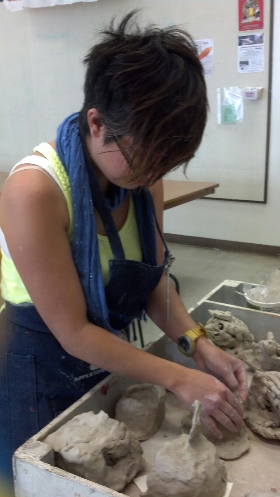
JANELL: Teacher for the kindergarten Saturday Exploring Art Class at Honolulu Art Academy School at Linekona. The class was about clay and making castles or houses out of them.

Janell repairing a few of the houses
until their suitable for the kiln when
class was over since scoring wasn't
done properly to attach ornaments.
Successes:
  • Did a drawing activity before using the clay so the kids can get an idea of what to create
  • Was able to get all the students to actually make things with clay today (because apparently there are several kids that hadn't been doing work in the past two weeks)
  • Majority of the kids got the idea that they would be making buildings out of clay
  • Another assistant from another class got that what they were making out of clay were actually buildings (and not teacups or something because some of those things weren't very building-like)
Breakdowns:
  • Class got out of hand several times
  • The security guard visited twice
  • Kids using clay tools inappropriately like trying to use skewers for swords instead of scoring the clay
  • Several kids using different tactics to gain attention like kicking, stealing things, taking too much supplies, etc.
  • Kids didn't listen to directions on how to score things so their objects would stay attached to each other
Opportunities:
  • There were two assistants instead of one helping her today
  • The director of the art school came in to see how the day was since she was already aware of the behavioral problems in this class


SKYE: My 11 year old sister. She was cleaning her room on Sunday. I asked if I could take a picture of her doing so, which she agreed to at first but then she took it back because she's a stubborn preteen and is most likely embarrassed by her room...

But here's an embarrassing picture I found of the
two of us from Chuck E. Cheese.
(Hopefully I can get a picture of her
cleaning since she isn't done yet)

Successes:
  •  Found things she was missing
  • She gave me back my computer chair (I was wondering where it went after I came back from my stay in Florida...)
  • She sings to my music playing from my room to pass the time
Breakdowns:
  • Extremely messy
  • Kept getting distracted by her phone and laptop 
  • Too many knickknacks filling the numerous bins/drawers she should be using to organize 
  • Things in drawers aren't sorted
  • Didn't finish cleaning today
  • Too much laundry to fold
  • Trundle bed making it possible to just pile things up on there instead of putting them away; giving an excuse that there's "nothing on the floor"
Opportunities:
  • Made more room on her shelves for things
  • Could take out the trash from her organizing bins and actually USE those bins to organize
  • Some of those things belong to me and should be returned to me ):<

B R A I N S T O R M I N G   N E E D S / G O A L S

  1. Janell could find an app solely based on art projects for kids that have little attention spans
  2. Janell and the director could create an app that updates with summaries of what happens during class the parents can access
  3. Could also use the app to send messages to specific parents about specific children
  4. Could use the app to provide a tentative schedule of what will happen in class next week Saturday so the parents can prepare the children 
  5. Using the same app, display the some of students work they did for the day that the parents can see (not all since they do eventually make it home and there's also a gallery show at the end of the semester for all the classes)
  6. Find an app that has children's artwork to get inspiration of what kids can do at that age
  7. Have an app giving tips about how to control a crazy classroom
  8. Because the class was loud, the security guard came in, so how about an app that monitors the loudness of an environment that plays an alert or sound of some sort to acknowledge that the place is too loud
  9. Create an app for my sister to create an inventory for her things?
  10. More specifically inventory/sort some of her books
  11. Go paperless and replace some of those books with eBooks in a reading app
  12. Skye seems to like going on her phone and laptop a lot (even during homework time); maybe create an app with a timer giving her an hour to work and then ten minutes to "play" then it's back to work again until everything is done
  13. Have an app to make a listing available to sell an unneeded item on an online auction/selling site
  14. Have an app on her phone that silences any activity/nonproductivity-based apps and only have phone available
  15. Have an app create a playlist based on the music she likes that she can play while she cleans so it's not just boring silence

F I N D I N G   I N S P I R A T I O N

  1. Bulletin Boards: While at the Disney College Program, we weren't allowed to put things on our walls to decorate our apartments, but they did provide us with cork bulletin boards in each bedroom and in the dining room. Each of my suitemates and I had different ways of expressing ourselves and decorating. My roommate Arielle hung her jewelry on hers. I put my Disney trading pins and other merchandise I found during my stay. Natalie put up letters from friends and family from home, Nicole brought pictures from home to put up, and Dominique had her schedule for work and a calendar as well. It gives everyone a space to personalize and organize things without boundaries... except for the space it provides. I ended up getting one for my room when I got home.
  2. Computer Drawing Tablets: Note, not like an iPad, but more of a Wacom used to draw or design on the computer. I've had my Wacom Graphire 3 since 8th grade, which is currently on its last legs since the wire's crimped, but I love it so much. It has a plastic case over the drawing area that is removable, letting me put things under it -- another customization thing. Then the actually function of the tablet allows a physical activity like using a pencil on paper be translated digitally and directly to the computer screen. I love how it's sensitive to the pressure of your hand on the pen so it can capture the flow and feeling of each line made.
  3. Mini umbrellas: Not the ones for your drinks, but like the reallllly tiny ones, probably the length of your hand when folded up, that humans can actually use and Totes is really good at making. I like them a lot since they're small enough to fit into my smallest purse (which is, I want to say 6"x3"x5"?) and still have room for my wallet, keys, and phone. Then when it's open, it's big enough to shelter you from the rain. It's size makes it easily portable so you can practically leave it in your bag without sacrificing space for something else then have it ready just in case of a surprise downpour.
  4. Sunsets: I prefer them over sunrises since you don't need to sacrifice sleep to see them (unless you're in a different part of the world where the sunset while you're sleeping or something). But the beauty of it is amazing. But it's a natural occurrence that people don't usually take the time to admire since they know it's supposed to look amazing and there will always be another one tomorrow. So, beauty that's supposed to be beautiful--and can go unrecognized until finding the time to actually look at it. I don't really know how to word it XD
  5. Hand-made quilts: Comfy, cozy, and warm. Made by hand with the user in mind, aesthetic-wise. You're not going to make a Batman quilt for someone who like unicorns and rainbows, are you? Anyway, it can be used over and over, and not just for the bed. It can become the roof of a fort or a magic carpet to travel the world. It's familiar and welcoming no matter how many times you use it. But it's also something that can be passed down from generation to generation, creating tradition.

V I D E O  T I M E

 Almost 8 minutes of babbling. Here you go:


Monday, February 4, 2013

Curing the Queue: Part One - Planning

So the supposed assignment for this design class is to ~redesign~ waiting in line. Working at Walt Disney World, as I previously stated in my first two blog posts, I have A LOT of experience with waiting in line. Both Walt Disney World and my visits to Universal Studios Orland/Islands of Adventure have proved to help with coming up with a few ideas.

BRAINSTORMING (at least 20 ideas)
What to do while waiting in line:

  1. Check email/twitter/facebook/skype/tumblr/other social networks/etc. on smartphone/tablet device
  2. Talk to the person next to you in line, whether it's your friend or a stranger (make a new friend!)
  3. Play a game on portable gaming device/smartphone
  4. Listen to music
  5. Draw
  6. Play I Spy with friend/new found friend
  7. Call a relative/friend you haven't talked to in a while
  8. Look up at the clouds and find shapes?
  9. Listen to music
  10. Crack knuckles/joints?
  11. Sing to yourself?
  12. Keep hydrated?
  13. Have your friend (not a new one) get a snack/drink for you to share 
  14. Like Disney/Universal Studios, enable a FastPass/Express Lane ticket system to get before waiting in line, then spend that time that could have been standing in line doing other things THEN go when that ticket says you can.
  15. Look up random articles on Wikipedia. Learn things?
  16. Read a book/newspaper/magazine/graphic novel - whether in print/online
  17.  Watch a movie on mobile device
  18.  Watch random funny videos from youtube
  19.  Secretly pick your nose (?????????)
  20.  Play a word game via association. 
I couldn't really use ideas that WDW/US has used to make queuing areas interesting like putting interactive screens within the location for guests to play with or make extremely detailed environments that related to whatever they're waiting for that they can stare at/strike up conversations about while they wait.

FAVORITES:

One of my favorites has to be the last one that I just recalled because I spent the day at my cousin's house (since it was the Superbowl/one of my cousin's birthday). Back in 6th/7th grade, I came up with a word association game called Pizza (because it was always the first word
to be used for some reason) and we did use it to kill time. Between 2 or more people, start with "pizza" and take turns coming up with the next word which can either start with the same letter or being something related to it; try not to repeat words and limit yourself to 1 or 2 words at a time.

My second favorite is a combo of looking up random facts/wikipedia articles since I used to tweet a random fact a day on my twitter account (when I was a very avid twitter user). Just generate random articles/facts at a push of a button.

PROTOTYPING:
PIZZA:


RANDOM FACT:
I decided to slim it down some more and make it date specific instead of just pulling random facts.


OUT IN THE FIELD & FEEDBACK:
Since I was super busy this whole week, I didn't have time to plan this out until Sunday, but I'll bring these Prototyping ideas to school on Monday and try them out with some friends. Pictures and feedback will be included in a new blog post called Curing the Queue: Part Two - Executing.

Monday, January 28, 2013

Make the Most out of Mobile Magic

(image source)
As a former Disney Cast member and Disney Guest as well, I know the frustrations of trying to navigate through Walt Disney World the most efficient way possible. (Although, I guess I can be biased since I got to know Magic Kingdom like the back of my hand during my employment.) Not everyone's a Disney Employee or is able to hire a Guest Relations Cast Member to take them around the parks, allowing them in-the-know information about the park and lines.

Fortunately, the Disney Company has developed the Disney Mobile Magic app, which available in the Google Play Store for Androids as well as the Apple App Store for iPhones. It's free and was launched in 2010.

On start up, the app immediately tries to find your phone via GPS to pinpoint your location, but it's not necessary to use it; it'll just turn off any location-based features. If GPS can't find you, you're able to pick between Walt Disney World (the resort in Orlando, Flordia) or Disneyland (the resort in Anaheim, California). Because I'm more familiar with Walt Disney World, I'll be describing what will be displayed on the screen for that resort only.

Upon choosing Walt Disney World with GPS off, a list prompts "Walt Disney World has a lot to offer. What would you like to explore?" and includes a list of the parks and several resorts.
  • Magic Kingdom
  • Epcot
  • Disney's Hollywood Studios 
  • Disney's Animal Kingdom
  • Typhoon Lagoon
  • Blizzard Beach
  • Downtown Disney
  • ESPN Wide World of Sports Complex
  • Disney Resorts
Upon clicking any of the locations, you're either given a sublist of other locations within those areas or a list of today's events and a guide map of the area (after the sublist, those will show up as well). If you want to go back, you have to Relocate, which will have you try use GPS again. This is kind of troubling for me as a person who's currently not at a park, but it does make sense since it's an app geared more toward current Park Guests.

Maps are marked with Stars for locations of interest showing times they're open and upon clicking them, you can view that location's schedule, its description, handicap/hearing accessibility, how to get there, mark it as a favorite, or set a reminder for that place.

For parks, there's a list consiting of:
  • Guide Map
  • Attractions - Shows wait times for rides/FastPass availability
  • Characters - Where/When characters are available
  • Dining - Where to eat/Make reservations/View Dining options
  • Today's Events
  • Weather
  • Games - Try a Disney Park trivia game!
  • My Favorites - Your list of favorite locations
  • Transportation - Information on travel by monorail, ferries, or ground transportation
  • Shopping - Where to shop and when shops are open
  • Guest Services - Find locations of Guest Relations, Bathrooms, First Aid, Baby Care, ATMs, Smoking Areas, Automatic External Defibrillators, Picture Spots, and Disney Vacation Club Information Centers
Resorts have a list that says:
  • Guide Map
  • Recreation - Locate activities found on the resort
  • Dining - Find restaurants and book reservations
  • Weather
  • Transportation - Monorail/Bus/Ferry information
  • Games - Disney Trivia again!
  • My Favorites - List of your favorite spots
  • Shopping - Where gift shops are and when they're open
  • Guest Services - Information on Resort Benefits & Info, Restroom locations, ATM Locations, Smoking Area locations, AED locations, and Disney Vacation Club Infromation Center locations
Although really helpful, especially for booking restaurant reservations, I do recommended NOT relying on the app MOST OF THE TIME for information. Use it as a resource, but don't be afraid to rely on the nearest Cast Member to clarify any doubts.

As a former Character Attendant, ALWAYS double check on character times with Character Attendant Cast Members for accurate times/when to return. I had a lot of angry Guests come up to me with the excuse of, "But the app said they'd be out till XX PM!" Yes, the character is out that long, but sometimes their lines will close before then, because we have to determine how many people they can see so they actually LEAVE at that time.

CAST MEMBERS CAN BE YOUR BEST FRIENDS, SO DON'T BE AFRAID TO ASK US QUESTIONS. If we can't find the answer, we'll try our best to find through another person. We want you to enjoy your vacation and YES we do know how much money you probably spent on this trip. Most of the things we warn you about are for not only Cast Member Safety, but your safety as well.

Sunday, January 27, 2013

Dangerous Design

Not to have the title throw any of the readers off, but I have a thing for alliteration titles.


It's my last semester as an Undergraduate at Hawaii Pacific University in Honolulu, HI, and hopefully I'll be graduating in the Spring with a degree in Digital Media.

Here's the catch: my major was discontinued as of Fall 2011, if I'm not mistaken. I had the option of keeping it or moving to the new on, Integrated Multimedia. I said to myself, "Eh, what the heck, I've already done two years of this stuff, so I'll just stick with it." And stick with it I did.


Although, I didn't really foresee the dwindling amount of enrollment in some classes which would cause cancellations in the future. Well, I didn't really have to deal with it until THIS semester a.k.a. my LAST semester.

Myself (right) in my Character attendant uniform
with Aladdin (left; my favorite character)
dressed as Prince Ali.
I was away from the island May 2012 to the first few days of January 2013 since I was in Orlando, FL participating in the Disney College Program at Walt Disney World. I was a Character Attendant at Magic Kingdom for seven months.

I was also taking 4 online classes through HPU while I was there since I had to keep my status as a full-time student in order to maintain my scholarship through the university--which was hard as a full-time employee at the busiest theme park on Earth. The only means of contacting anyone back home was either by phone or internet.

I was able to find out about Spring 2013 registration around late October through someone posting on Facebook about being able to get all the classes they wanted. After work, I hopped on to try register myself (after paying the Technology Fee that doesn't really matter to me since I'm off the island), only to find out 3 out of the 4 required classes for my major were not available.
MULT 3470 TV Studio Production
MULT 3560 Video Production II
MULT 3700 Radio Production
Upset, I called my advising counselor about it a week after and she said she'd email the heads of my department. Unfortunately, I didn't get any information, so I tried calling her again around mid December. She sent another message, and I got nothing. The whole thing was really frustrating since I was over 6000 miles away and it wasn't like I could hop on a bus to head to downtown Honolulu to talk to my counselor and professors in person. I honestly felt hopeless. It wasn't until I came back to have a face-to-face meeting with her 5 days before school started and she sent ANOTHER email, I got a phone number and someone to talk to.

I was able to substitute MULT 3470 for MULT 4702 Mobile Design and MULT 3700 with Advance Motion Graphics. I also was able to organize a Direct Study of MULT 3560 with Dr. Britos... Well, I still need to get the request signed by the Chairman and the Registrar). Once everything's sorted out, I can submit my petition to graduate.

I'm not exactly sure how Mobile Design can replace TV Studio Production, but we were running low on MULT class choices I think since I've taken all the other MULT classes available. It's not a class Digital Media majors are required to take, so it didn't even cross my mind during my initial registration process. I was told about the Advance Motion Graphics class by other video production students that were in the Integrated Media major, geared more toward Cinematic Production, but, to be honest, video production isn't really my cup of tea.

I'm kind of interested on what Mobile design has to offer since I mostly focus on web and print design, so it will be interesting to concentrate on a different platform.

I'm looking forward to what this semester will bring (especially through all the headaches I had to go through to get here).